What is the Survey Analysis Report©
The survey analysis reports of online survey vendors like SurveyMonkey, Zoho Survey, SurveyGizmo, and others do not drill deeply enough to uncover all the useful insights hidden in your survey data.
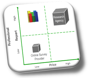
Survey Analysis Report© bridges the gap between the superficial survey reports of online providers and the expensive market research agencies.
We analyze your survey data just as top-tier marketing research agencies do. But for a fraction of the price they charge.
How is that possible?
Thanks to our extensive experience in the field of marketing research and our ability to write efficient software code.
Our analysts have headed up the Marketing Research & Strategic Insights role at renowned multinational companies and consulting agencies. They know how surveys and survey reports work. Their priceless experience made it possible to develop proprietary software that allows MarketingStat to deliver valuable insights to business people, students, and instructors in a fast, professional, and convenient manner.
Assign your important survey analysis to a professional analyst. MarketingStat can help – At a price even students can afford!
What’s inside the Survey Analysis Report©
MarketingStat’s Survey Analysis Report© supplies you with all you need to dig into the survey data in a granular manner. There are several sections:
-
-
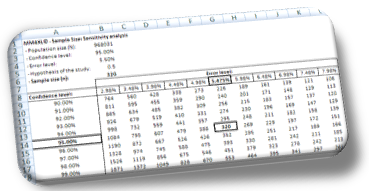
- Sample Size Analysis at different levels of Confidence Interval and Error
- Survey Dataset
- Cross tables with percentages in both directions (rows and columns)

- Descriptive Statistics and Box-Plots for all variables
- Correlation Analysis for all variables
- Cluster Analysis in both directions: Respondents and variables
On demand we can also:
-
-
- Get the survey data in shape and ready for analysis
- Code text, such as open-ended questions, comments from socials, and the like
- Recruit respondents to your online survey
-
Our Survey Analysis Report.
All you need to deliver a better job.Sample Size Sensitivity Analysis
Sampling is like cooking spaghetti. You try one strand to decide if they are all cooked. But you run the risk of saying the pasta is cooked when it is not.
Making a mistake when cooking at home may be disappointing.
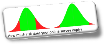
But how much risk are you taking when making decisions with an online sample survey?The Sample Size section of the Survey Analysis Report© tells you exactly this: The amount of risk your sample carries.
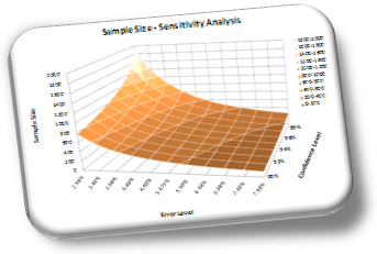
Try MarketingStat’s Sample Size Calculator
Learn how to plan the sample design and how to evaluate the sample size of surveys. You will make better decisions because your surveys will supply you with all the information you need.
Knowing the amount of risk implied in a sample:
- Helps in fine-tuning future surveys
- Helps in interpreting data correctly
- Is a valid source for academic and professional papers
Read this article on survey sampling
How much risk are you taking with your online sample?
MarketingStat’s Survey Analysis Report helps you find out!Survey Dataset
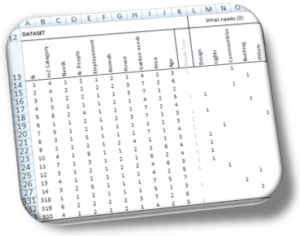
Order brings clarity and helps in understanding things better.
This section of the Survey Analysis Report brings order to your survey data.
Your survey data is coded appropriately and is stored in an Excel sheet ready for additional analysis.
No time to prepare your survey data for analysis?
No worries. We do it for you.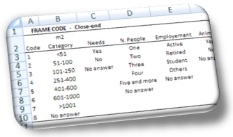
We code both closed- and open-ended variables (survey answers), so they can be easily turned into useful contingency tables and more. Each variable is stored together with its own frame code. This gives transparency to your insights.
Bring order to your surveys.
Squeeze out all the information you worked hard to gather.Cross Tables – Both Column and Row Directions
There is a reason why contingency tables, aka cross tables or crosstabs, are perhaps the most important segmentation tool of professional survey analysts.
Read also How to read crosstabs
An old saying goes “You cannot swallow an elephant but you can eat it one slice at the time”. Contingency tables are the tool that slices the elephant.
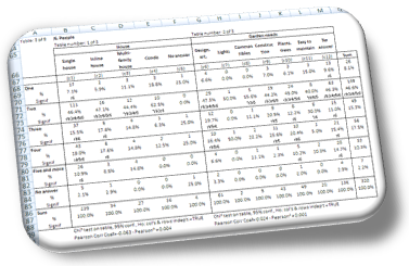 CrossTabs enable you to dig deep into survey data in a systematic way, to turn data into information that can ignite the capacity to generate insights.
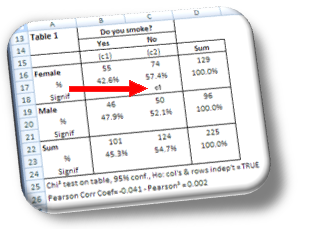
In a two-way cross-table two variables, the answers to two questions, are crossed and presented in the form of counts. For instance, we ask 96 men and 129 women whether they smoke or not. The professional cross-tabulation of the two variables would look like Table 1 below, where we read 46 Male respondents said they smoke and 50 don’t while Females are 55 to 74 smokers to non-smokers.
In turn, counts are converted to percentages, to help the analyst figure out the proportions between sub-groups of respondents. Proportions, or percentages, are important because they can identify groups or clusters of respondents with common characteristics, they help in prioritizing, and, very important, percentages allow testing the significance of their differences.
What does testing the significance of the difference of two proportions mean?
Take table 1: of the 96 male respondents, 47.9% said they smoke and 52.1% said they don’t. One could be tempted to state non-smokers outnumber smokers by 4.2%, but this wouldn’t be true. In fact, we are reading the results of a survey conducted at the 95% confidence level and an error level equal to 6.53%. Therefore, in order to confirm the proportion of non-smokers is higher than that of smokers it is necessary to test the significance of the difference between the two proportions (4.2%). The question becomes: Is the 4.2% difference between smokers and non-smokers large enough to state that the quantity of the latter is really larger than the former?
-
-
In our case, with a sub-sample of 96 male respondents, the difference is not large enough to confirm the two proportions differ. In this case, we must read the percentages as two equal numbers, say 50% and 50%. There is a difference, however, between the proportions of female smokers and non-smokers (see red arrow).
MarketingStat’s Survey Analysis Report applies the Z-Test at the 95% confidence level to verify the significance of differences.
How much risk are you taking with your online sample?
MarketingStat’s Survey Analysis Report helps you find out!Descriptive Statistics and Box-Plots
The Descriptive Analysis section of the Survey Analysis Report© makes available the basic elements of survey data analysis.
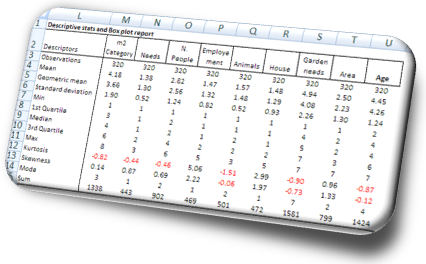
For each variable of the survey we deliver a number of descriptive statistics useful for improving the understanding of the survey results. Together with the box-plots, they are the first step to making better-informed decisions.
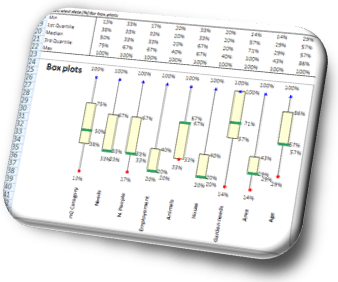
The box-plots visualize the main descriptive statistics of each variable of a survey. These statistics are often used to build scenario models simulated with the Monte Carlo technique.
Don’t be left behind.
Learn how today’s marketing champions handle surveys.Correlation Analysis
Understanding the strength of the relationship between variables may help in avoiding redundant analyses, and sometimes finding very useful constructs, such as those concerning emotions and beliefs.
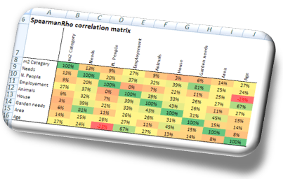
The Survey Analysis Report includes a matrix of correlation values computed according to the nature of the variable data.
Continuous variables, like age, income, or time to execute, for instance, are treated with the Pearson’s correlation coefficient, whereas with discrete variables we use the Spearman’s correlation coefficient.
It must be remembered that correlation does not mean causation. Just because two variables are correlated does not mean that one causes the other. Once you are aware of this, correlation analysis is definitely a technique every decision-maker must learn.
It’s not about how many tools you have.
It’s about using the right tool at the right time.Cluster Analysis
Are you looking for homogeneous groups? The Cluster Analysis (CA) of the Survey Analysis Report is the right place to look.
For each report we run two separate CA’s to find:
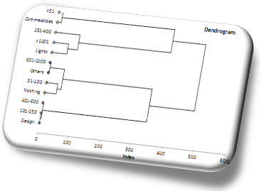
- Groups among respondents (for instance 320 interviews)
- Clusters among variables (or questions).
These two views shed valuable light on hidden aspects underlying your survey data.
The dendrogram is a valid and intuitive tool for grasping the data structure at a glance. The sooner two variables group together the more homogeneous their group. It’s that simple.
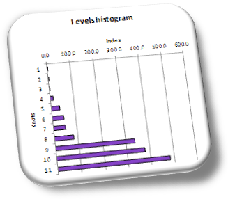 We apply Ward’s clustering method because it automatically finds the number of clusters in the data, thus reducing any bias of the analyst.
Can you estimate how many major groups the histogram to the left suggests the CA found in our data?
And can you find these groups on the dendrogram above?
If it’s homogeneous groups you are looking for,
MarketingStat’s Survey Analysis Report© helps you find ’em!Perceptual Maps [service on demand]
When the relationship between data is more important than the data itself, an association map is the best way to visualize those relationships.
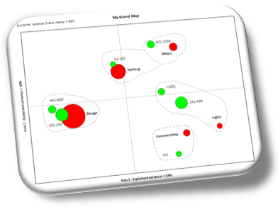
We apply Correspondence Analysis to draw perceptual maps like this, and we call it Brand Mapping.
These maps are easy to interpret and extremely rich in information. Moreover, their interpretation can be made in light of the analyst’s prior knowledge, which is a great way to stimulate strategic thinking. Modern, best-in-class marketers love this tool.
The book Mapping Markets for Strategic Purposes
is the best source to learn about Brand Mapping.Read also this article on Brand Mapping:
How to go from data to information to insights and unleash the power of strategic thinkingThe power of mapping: Visual, clear, strategic.

